Aug 13, 2025
Color Grading
The Look Is Half the Story
In unscripted television, story is everything—until you hit picture lock and realize it’s not.
You can have your best story team firing on all cylinders, a clean stringout, and brilliant interviews—but if the final cut looks muddy, flat, or inconsistent, none of it lands. It’s not about slapping on a “look.” It’s about building a consistent visual logic that enhances story without distracting from it. For too long, color grading in unscripted has been treated like a checkbox: one last step, one last fire drill.
It shows.
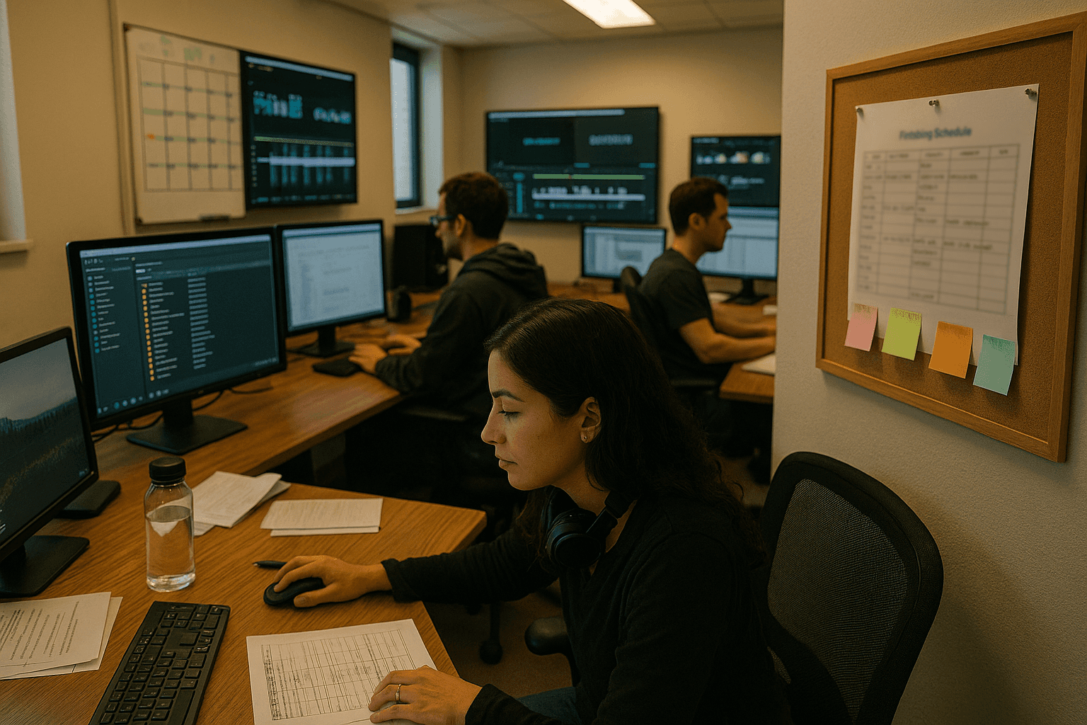
Where the Process Breaks Down
Let’s be honest: in unscripted, color is usually reactive. You hand it off to a finishing artist after the show “finishes”—which is to say, after multiple conforms, locked-ish cuts, and late-breaking network notes. The colorist gets a rough export cobbled from mixed cameras, LUTs, archive clips, and hand-labeled presets.
Then we ask them to
“Just make it match.”
The problem isn’t lack of talent. The artists doing this work are incredibly good, often working miracles. The problem is the system they're dropped into:
There’s no grade plan baked into the post pipeline.
No unified camera LUT strategy during production.
Poor metadata transfer—or none at all—between dailies, offline, and online.
Formatting choices (Frame.io exports, offline flags) still influencing final decisions.
It’s not that we ignore color—it’s that we treat it as a cleanup job, not part of the story development. That’s a mistake.
How We Integrated Grading Into the Story Pipeline
We stopped treating grading as a finishing step. Instead, we made it an early and ongoing part of docu-style story development. The system we built isn’t complicated, but it does require a mindset shift: color supports story, so color must be designed with story in mind. Here’s how we changed things:
1. Camera LUT Strategy at Ingest
We worked with production teams to create look-intentional LUTs per camera package and per scene type (sit-down, B-roll, cinema vérité). These LUTs weren’t just technical—they were about mood. Before a frame hit the dailies bin, it carried visual metadata aligned with the show’s tone.
We also enforced one rule: no “quick color” in the offline. Offline editors could lift shadows or correct exposure for story clarity—but no Amazon LUT layering, no “punchy” presets to sway tone. Less confusion later.
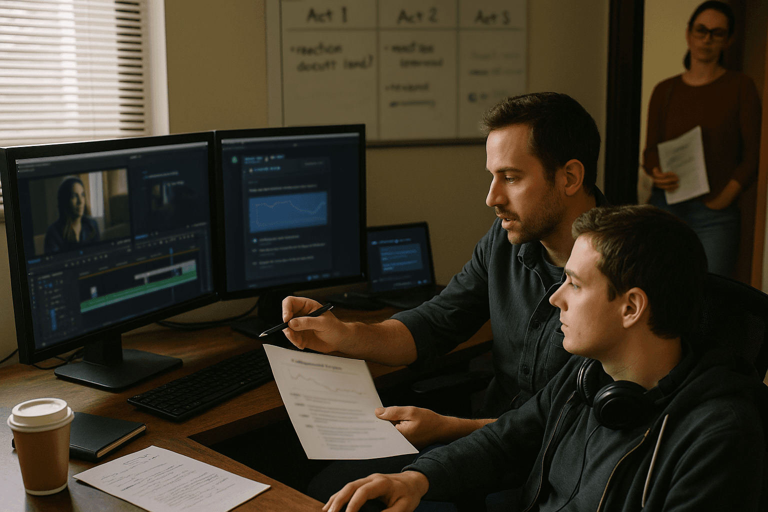
2. Story Color Pass Before Lock
Instead of waiting until final lock, producers sat with a dedicated “story colorist” mid-season—their job wasn't to polish, it was to help define tonal consistency across arcs.
This wasn’t technical grade; this was intentional picture context.
→ Does the tension feel earned in this scene’s lighting?
→ Are interview looks reflecting the authenticity of the subject?
→ Can we modulate camera looks to reflect emotional escalation?
We tagged reference moments for the final grade—not just “match this," but “expand this.” The final colorist used these anchors to build the grade, not guess at it.
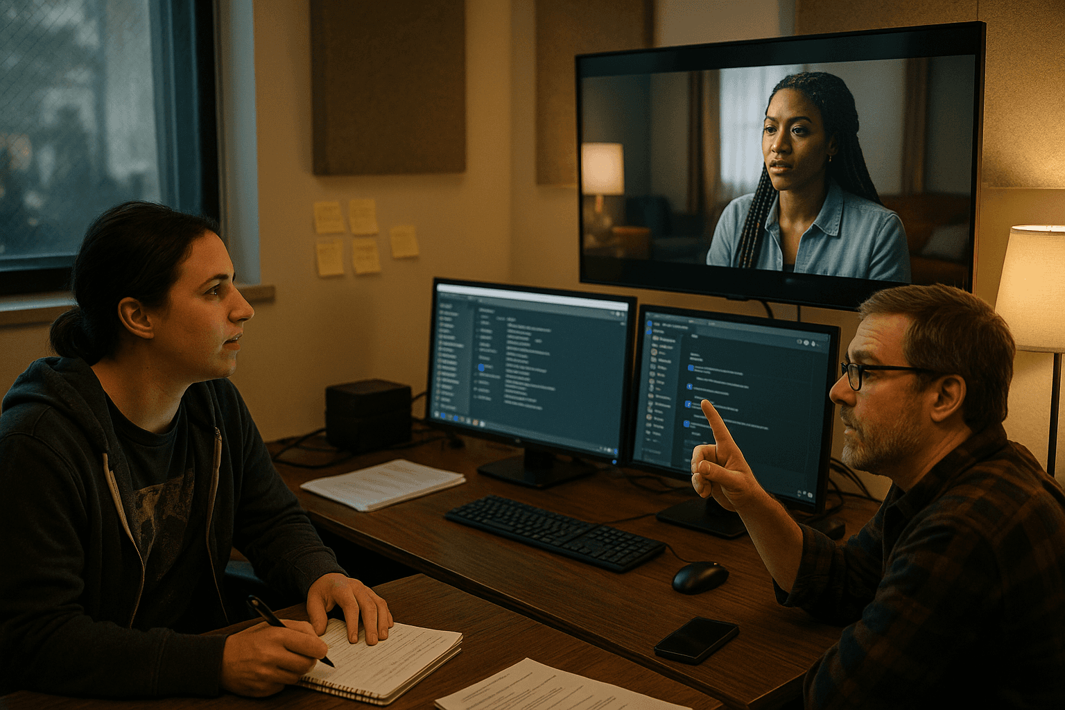
3. Grade Review Is Editorial, Not Just Technical
Color review became a creatively meaningful check-in, not a pass/fail QC viewer. EPs didn’t just toggle between “too green” and “not warm enough”—they talked about pacing, tension, nuance. And because narrative choices had already guided look decisions upstream, the review wasn’t a re-litigation.
We also built a buffer: two days between story lock and tech lock, with dedicated time for story-based grade input. That meant fewer late fixes and no “can we de-emphasize that guy’s red shirt?” three hours before delivery.
What Changed in the Grade—and on the Team
→ Operationally, the grade room got quieter. Grading days were purposeful, not overbooked and reactive. Artists had more time to finesse because they weren’t unraveling guesswork.
→ Editors weren’t burned out navigating last-minute regrades—because picture intention had already been respected along the way.
→ Showrunners had confidence. They weren’t “hoping it looks okay in color.” They’d seen and supervised a tonal scaffolding ahead of time.
Perhaps most importantly: scenes landed better. Because color was doing what it should—emotionally guiding without pulling focus. Archival clips felt lived-in. Sit-downs felt tactile. Chaos looked kinetic, not chaotic.
Unscripted doesn’t live or die by the perfect frame. But a consistent, intentional look helps the story feel coherent and deliberate—even when the content is messy. That sense of visual authorship offers trust, both to the audience and the network.
The Work’s Still Scrappy. The Look Shouldn’t Be.
We didn’t change the budget. We didn’t build a new tool. We just stopped treating finishing like a fire drill. By shifting some visual decision-making earlier—and folding it into story—color became part of how we built the show, not just how we wrapped it.
The teams who made this change don’t want to go back. Not because it’s fancy. But because it’s simple—and effective.
Unscripted will always move fast. That doesn’t mean we can’t be intentional about how it looks.
The audience might not know what a LUT is. But they can feel when a show has clarity—when the image supports the moment. That’s what color grading should be doing. It doesn’t have to be flashy.
It just has to work.